
Start with the rules people actually need.
A useful brand guide does not need to be huge. It needs to answer the questions that come up when a logo is placed, a color is chosen, a heading is typeset, or a file is sent to print.

1. Show the logo system clearly
Start with the main logo, alternate lockups, icon mark, and any single-color versions. The goal is to remove guesswork. A client should know which logo to use when space is tight, when the background is dark, and when print production needs a simpler file.
Add minimum size, clear space, and a few common mistakes to avoid. A small set of practical examples is often more useful than a long list of rules nobody remembers.
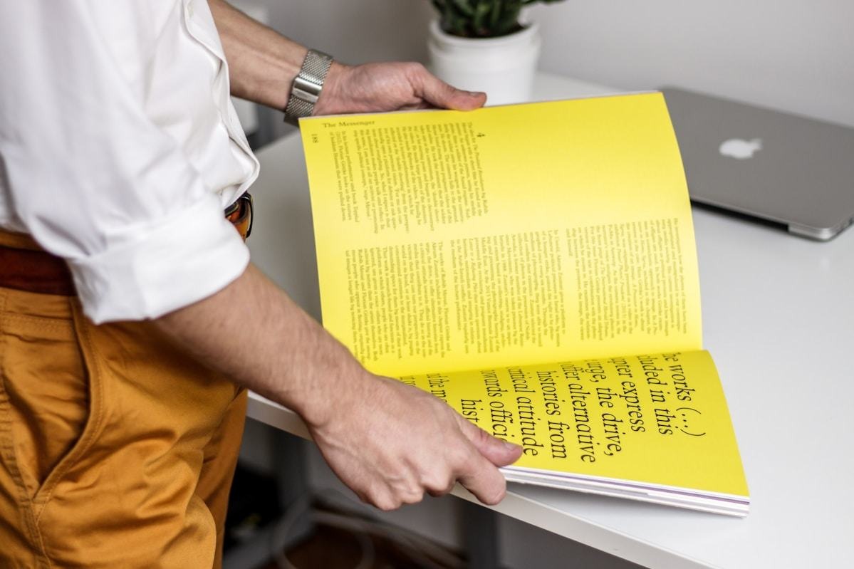
2. Make color decisions usable
Document the core palette first, then add support colors only when they have a clear job. Include HEX, RGB, and print-friendly values when relevant, and explain which colors are best for backgrounds, text, accents, and calls to action.
A strong palette section also shows contrast examples. If a color pairing is beautiful but hard to read, mark it as decorative rather than approving it for important text.
A good guide does not just display the brand. It helps someone use the brand correctly when you are not in the room.
3. Keep typography simple and repeatable
Choose the typefaces, weights, and rough size relationships that matter most. Show a headline, subheading, body paragraph, and small label. This gives people a repeatable hierarchy without turning the guide into a full design system manual.

4. End with production notes
Add the checks that prevent expensive mistakes: safe area, bleed, color mode, contrast, file naming, and approved export formats. These details help brand work survive the jump from concept to final output.