
Start with a color job, not just a color mood.
A good palette is more than a nice set of swatches. Each color needs a role, a readable pairing, and a reason to exist inside the brand system.

1. Give each color a clear role
Begin by deciding what each color does. One color might carry the main brand signal, another might support backgrounds, and a third might handle small accents or calls to action.
This keeps the palette from becoming a decorative pile of options. When every color has a job, decisions become faster and the brand feels more consistent.
2. Pull from images carefully
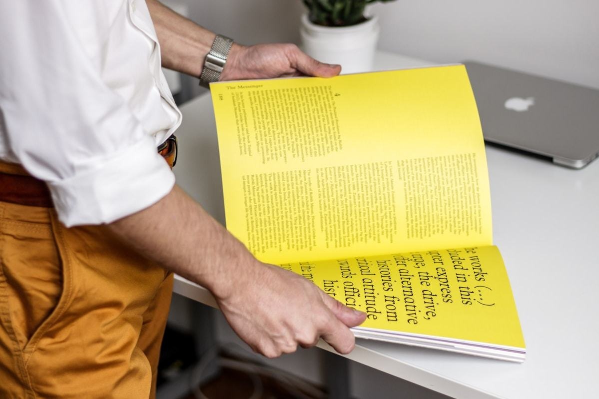
Images are a great starting point, but not every extracted color deserves to become part of the system. Choose the colors that support the tone of the brand and can survive real use.
After sampling, test the palette as text, backgrounds, buttons, and graphic accents. Useful palettes work in context, not only as isolated squares.
The strongest palettes feel expressive, but they still make everyday design decisions easier.
3. Build a practical hierarchy
Keep a primary color, a few supporting colors, and a neutral base. This gives designers enough range without making every new asset feel like a new interpretation of the brand.
4. Check contrast early
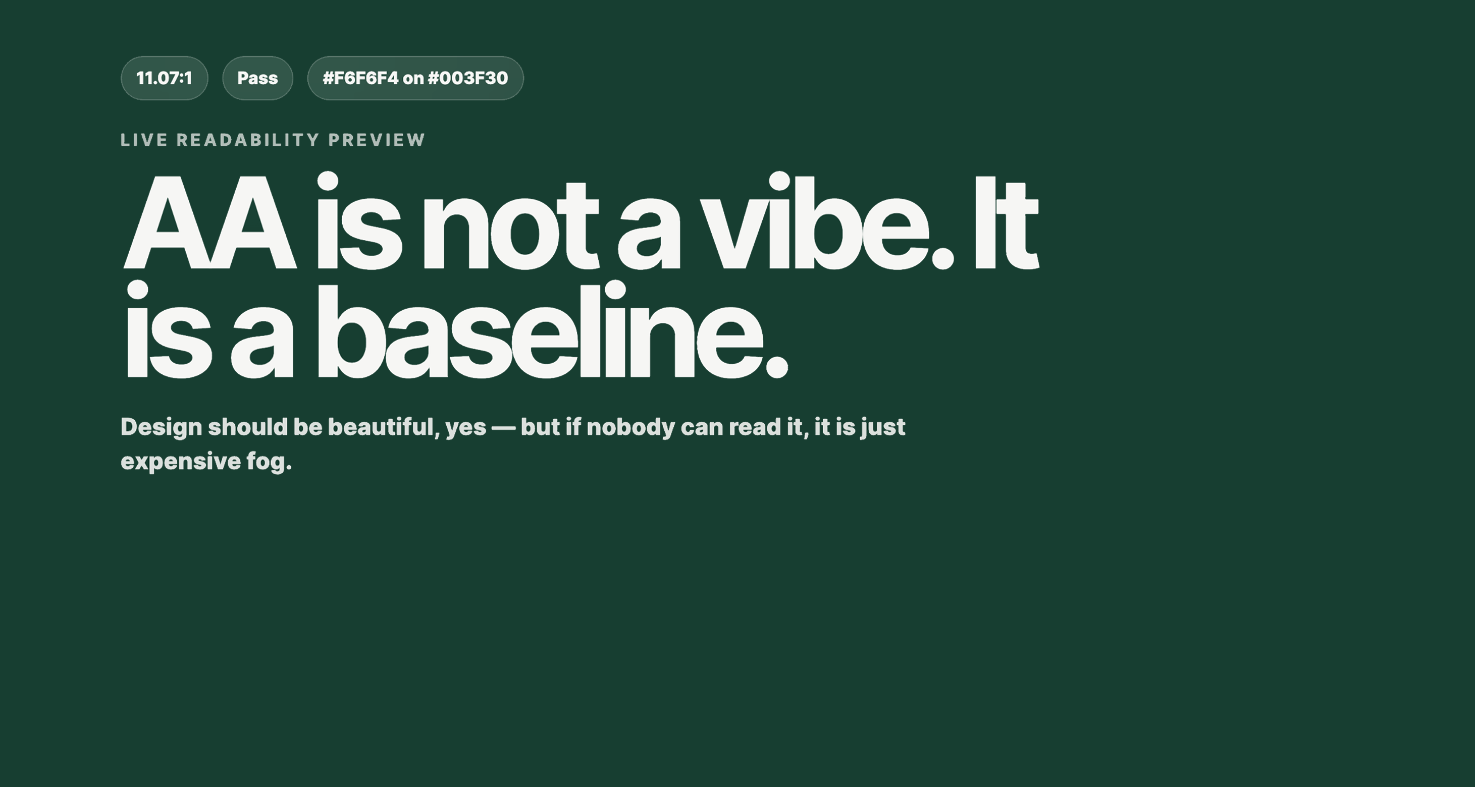
Before approving a palette, test foreground and background combinations. A beautiful color system still needs readable text, accessible buttons, and safe pairings for practical brand work.