
A logo is only useful when people can find the right file.
A strong logo kit turns design work into an organized system of usable assets. It helps clients, developers, printers, and collaborators move faster with fewer questions.
1. Include the versions people actually need
Package the primary logo, alternate lockups, icon mark, and single-color versions. If a logo has dark and light variants, make those easy to identify at a glance.
Avoid overwhelming clients with every working file. A useful kit is complete, but still simple enough to navigate.
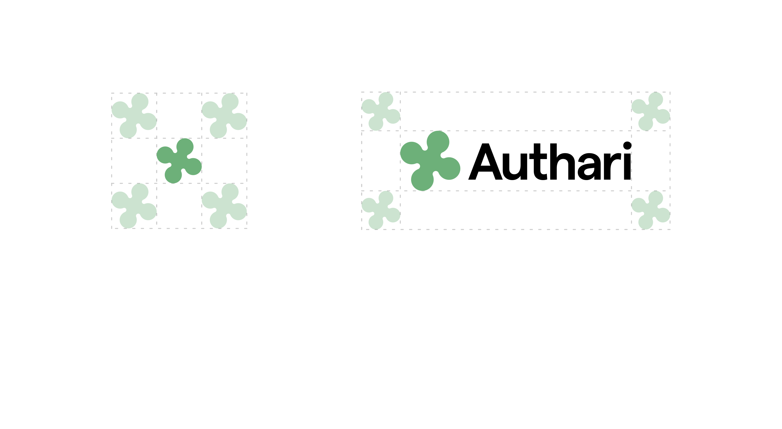
2. Name files like instructions
Good file names reduce support questions. Include the logo version, color mode, background intent, and file format when useful.
Names like primary-dark-background.svg or icon-black.png tell people what to use without opening every file.
A clean logo kit makes the brand feel more professional after the design work is done.
3. Separate formats by use
Keep vector files for production and scalable use, raster files for quick everyday needs, and transparent PNGs for simple placement. This prevents the wrong format from ending up in the wrong place.

4. Add a short usage note
A one-page note explaining when to use each version can save hours later. It does not need to be complex; it just needs to answer the most common handoff questions.